
Redesigning Alpha: more capabilities, a clearer process
When you keep innovating, new features keep arriving. We see that every day as we develop Alpha. Another way to configure a housing type, more information in a project, a new step towards sales: every addition has a purpose. But all those capabilities also need to make sense together. That is why we have revisited every screen in the application. The type editor and project editor show what that means in practice.
Applications tend to grow one step at a time. A feature gets its own tab, a setting joins an existing panel and a new check finds a place somewhere. People who followed that development often understand the layout. They know why something exists and where to find it. Someone starting today sees the whole application for the first time. Their questions are simpler: where do I start, what do I need to enter and when can I move on?
That is the challenge behind this redesign. We are working on the relationships between screens, the order of the work and the information needed at each stage. The construction work itself remains complex. An interface can help people navigate that complexity by making the next step recognisable and showing which parts still need attention.
We have reworked type configuration from the ground up. A housing type provides a basis for reuse across projects. It includes models, options, variables and rules about which choices can be combined. These parts depend on each other. A list of settings provides access to the available capabilities, but does not explain the order in which to put a type together.
The previous type editor placed many of these parts alongside each other as tabs. The redesigned editor organises the work into five stages: orient, define, build, constrain and verify. That sequence gives configuration a direction. Get an overview, describe and assemble the type, set the permitted combinations and then check the configuration. The underlying capabilities now have a place within that process.
The type editor’s home screen also has a different role. It shows configuration coverage, missing model files and items requiring attention. The example shown here still has outstanding checks. That illustrates the purpose of the overview: making unfinished work visible. The question is not just how many models or options exist, but what the current configuration needs before the work can move forward.
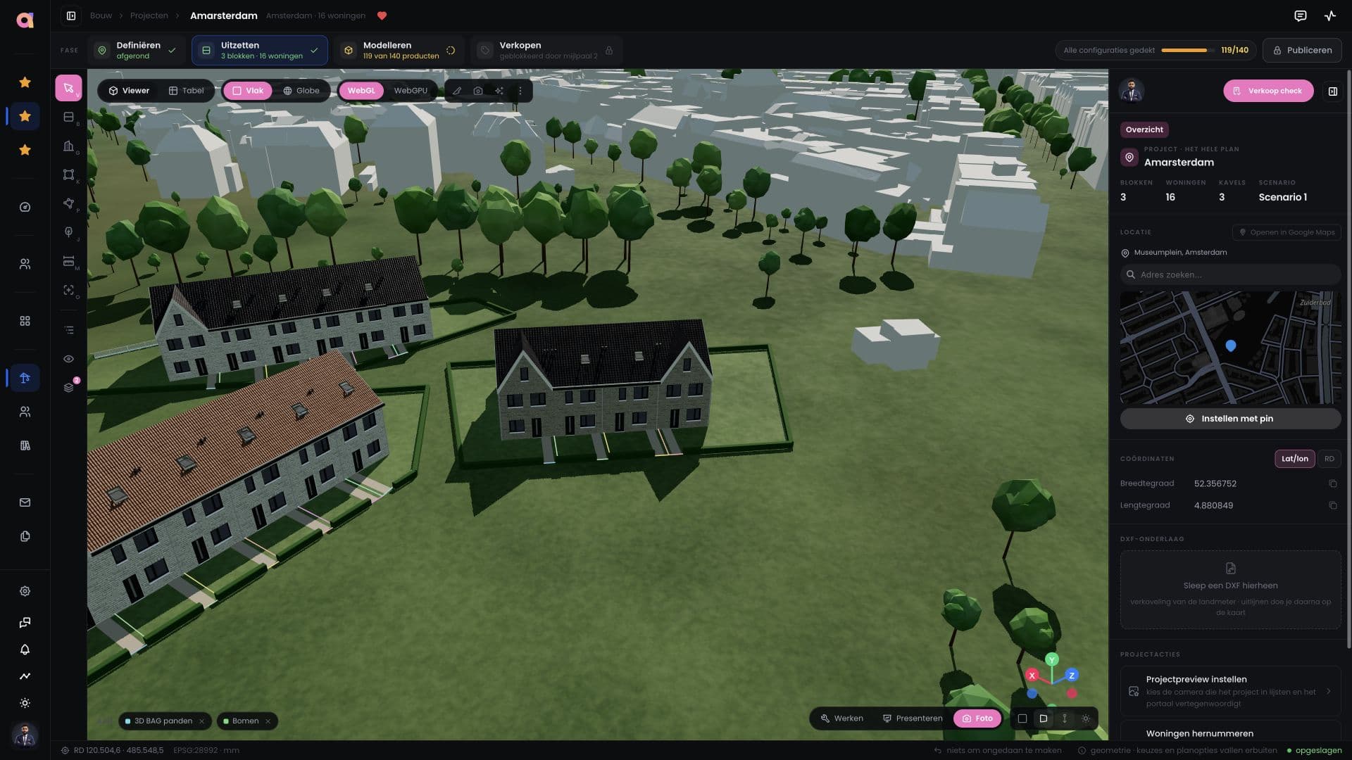
The project editor applies the same thinking at a different level. Here, the work concerns a specific project: homes, blocks, plots and the setting around the design. The screenshots show the same project in the previous and redesigned interfaces, using full BIM models with surrounding buildings and trees. That makes it possible to compare the layouts while keeping the project content recognisable.
In the redesigned project editor, the project stages sit at the top: define, lay out, model and sell. Their status indicates where the project stands and which parts still need attention. The design remains central, with tools beside it and project details in a separate panel. Our aim is to make the connection between an action in the model and the progress of the project easier to follow.
These two editors illustrate the wider approach across the application. Revisiting every screen also means deciding again what should be immediately visible. Which information supports the current task? Which settings belong together? Where should someone be able to check whether the work is complete? The goal is a recognisable way of working even when the content differs substantially between screens.
There is an ongoing balance to find. People working in Alpha every day want quick access to its capabilities. People carrying out a process less often benefit from clear steps and an explanation of its current status. Both ways of working need space. A layout that works today also needs to accommodate new capabilities without becoming difficult to navigate again.
We feel this is a meaningful improvement to the process. That confidence comes mainly from the connections between the parts: configuration has a clearer sequence, outstanding items are more visible and project stages sit closer to the design. This is not yet a measured time saving or a guarantee that every user will immediately find their way. Everyday use will show where the new structure helps and where it needs further refinement.
For us, innovation also means revisiting what is already there. New features are valuable when people can work with them effectively. This redesign gives Alpha’s growth a renewed structure, with room for further development. Take a look at the before and after screenshots below. We would like to hear which parts feel clearer and where you still have questions.


Let's talk.
Have a project in mind or want to learn more about what we do? Send us a message.